10 tell-tale signs of cheap website design
Cheaper products? Sure! A cheap website design? Certainly not. You wouldn’t compromise on the dress code for an important client meeting. Then, why compromise on your website design that is pivotal for your brand’s identity and marketing? After all, first impressions are the most lasting impressions! In a world where a brand’s web presence dictates its business prospects, a badly designed website has the potential to break your business. So, let’s look at ten deadly design sins that could drive your customers away:
1. A dated theme
It’s one thing to keep your website’s design simple and fuss-free, it’s another to use a theme from the bygone era. Successful embarkment on the digital bandwagon commands an au currant website design with state-of-the-art features. Use an outmoded theme and your visitors leave the page in a jiffy, declaring it stale.

2. A bad logo
Your logo is the identity of your brand, which automatically makes it one of the most significant areas you must work upon. A poorly designed logo is anything but attractive, and doesn’t quite hold the attention of the user. If you think your current logo is ambiguous, unappealing, and morally questionable (the Internet is burgeoning with such examples), it’s time to revise the design.
3. Low-resolution images
Nothing captures your visitors’ interest on the website like a bunch of striking pictures. Therefore, the last thing you want them to be presented with is pixelated, low-quality images that do nothing for the overall content. High-quality images, on the other hand, immediately attract the eye, and leave a long-lasting impression on the minds of your customers.
4. A chaotic layout
Pictures graphics, or slideshows, your content is what drives traffic to the website. A messy, unorganized layout is an immediate turn off for the reader as it disorients them. For instance, bad alignment, too many tabs and categories, and text-heavy paragraphs prevent quick scanning and infuriate your reader. Hence, it is imperative that your website’s layout is orderly and easy to navigate through.
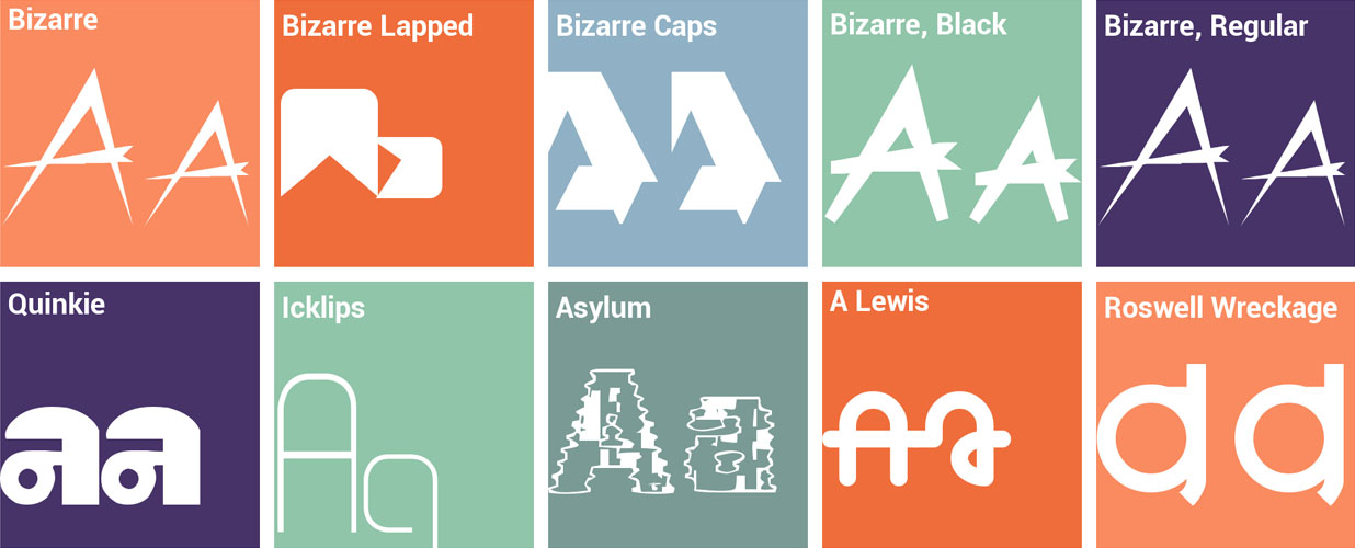
5. Bizarre font styles
Why make something as simple as reading a challenge for your visitor? Weird fonts over peculiar backgrounds immediately strain the eye, and keep the user from the information they seek on your website. Your website’s ultimate aim should be to communicate and connect with your readers in a simple, easy-to-read style.

6. Clutter or “useless dribble”
Too many boxes in one corner, and endless white space on another show signs of a poorly designed website interface. A winning interface, on the other hand, practices minimalism in their design while successfully conveying their message to the visitor. Discard all useless information from your website, for it only adds to the chaos, thus, baffling the visitor.
7. Loud color schemes
The science of colors suggests that certain shades trigger a variety of feelings and emotions in humans. While red elicits fury and rage, black triggers power and solidarity. Blue, on the other hand, has a calming effect on the eye, which is why user-populated websites such as Facebook and Twitter feature a blue-and-white colour scheme. The point is to pick a color combination that’s reassuring and true to your brand. Use a gaudy scheme and your visitors will shut the page as quickly as they landed on it.
8. Unnecessary pop up boxes
It’s okay to advertise on your website. It’s not okay to shove the ads on the user in the form of redundant pop ups. In-your-face advertising makes the user question your credibility, and is a tell-tale sign of a cheap website design. Even worse are full-screen pop ups that are all the more challenging for the user to close.
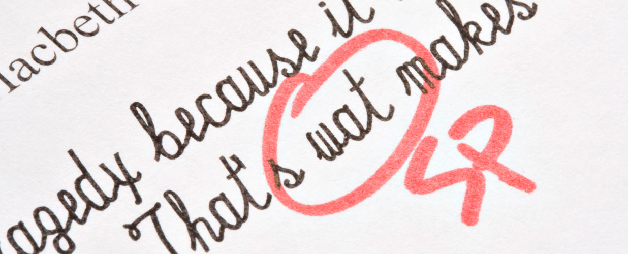
9. Spelling errors
Misspelled words, wrong grammar, and lousy punctuation are all you need to kill your online credibility. Think about it, how can a brand that can’t even spell right commit to serve their customers? Here’s what the visitor thinks when they spot a spelling mistake – “Wow. They couldn’t even care to fix a minor spelling issue. How can they expect me to trust them?”

10. Broken links
If majority of the links on your webpages lead to Error 404, you know it’s time to call up a web doctor! Too many links that do nothing not only impact your search engine rank, but leave a terrible impression on the user. Conduct an inspection of your website on a weekly basis, and fix all hyperlinks immediately.
A careless, cheap website design with teeming errors can have tremendous negative impact on your brand’s growth. Please your visitors by rectifying the above-mentioned blunders, and unlock the first level of successful business marketing
Image Credits:


