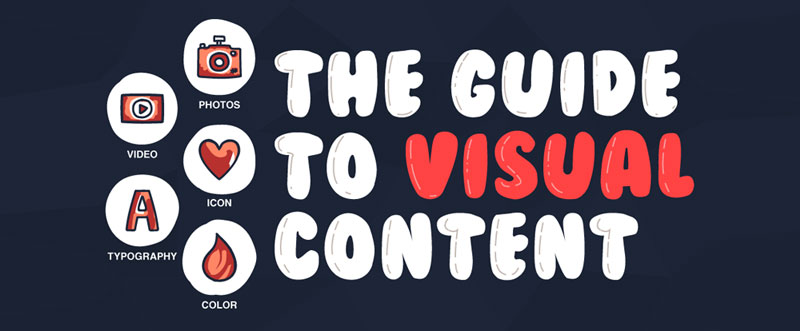
15 Tips to Help You Choose the Right Visual Content [Infographic]

15 TIPS TO HELP YOU CHOOSE THE RIGHT VISUAL CONTENT
Did you know that 90% of the information transmitted to the brain is visual? I thought I’d begin with that statistic to highlight the importance of visual content for your branding.
Humans are very visual creatures – other than the fact our brains work biologically to favour visual cues, it goes without saying our lives are busy and the quicker we can receive information the better.
We also retain visual cues much better, meaning that if a potential customer is introduced to your product but isn’t ready to make the purchase today – you have planted the seed for a sale later down the track.
Facebook’s algorithm is tough to crack since it started hiding fan pages after the launch of paid posts. The algorithm is in place to help sort through all the noise and populate users’ timelines with relevant content. It is known that as of recent – Facebook has started to favour the uploading of original video content.
On thing that never dies down is the demand for entertainment and light-hearted humour for us to momentarily escape our lives all in the name of comedy. Fans will follow pages just because of the funny and entertaining stuff that they post. Memes, GIFs and short videos are all ways to engage your audience and provide entertainment.
What colour defines your brand? Establishing a strong bright colour will go a long way to connecting your brand with its online identity. Think McDonald’s and its red & yellow logo!
Visual content is another very important aspect of your branding and marketing strategy.
The below infographic covers 15 tips to help you choose the right visual content for your business, is there anything that’s missing?
As always, please let us know your comments or any questions on Twitter (@thewebsitegroup ← Click to Tweet Us).

Infographic by Design Mantic


![How to Save Money Using Social Media [Infographic]](https://thewebsitegroup.co.uk/wp-content/uploads/2017/06/Save-Money-with-Social-Media-Featured-180x180.jpg)
![How to Save Money Using Social Media [Infographic]](https://thewebsitegroup.co.uk/wp-content/uploads/2015/09/Not-Everyone-Makes-a-Great-Customer-180x180.jpg)